Hello everyone! How was your weekend? I hope it was a good one. I got stranded in Holland due to the weather but made the best out of it and as a result, made some new friends and got to meet up with Eline Pellinkhof in her home city of Haarlem AND I was able to see a shop I've longed to see for several years now called Ottomania. It was such a great experience and I'm so glad that bad weather brought me to Haarlem though the travel bit was just horrible. I'm home now and made a little "me" time this morning as a result of the stressful journey back by train (a 4 hour trip took 17 hours and two days of freezing on platforms trying to go east into Germany) so a salon visit made everything right again. Total girl power! I thought I'd begin this week by announcing some good news and spotting a lovely trend. I thought I'd share the trend first and then, my next post, will highlight the very good news.
via Design Files the home of Lucy Young.
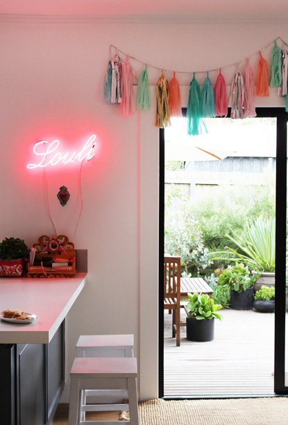
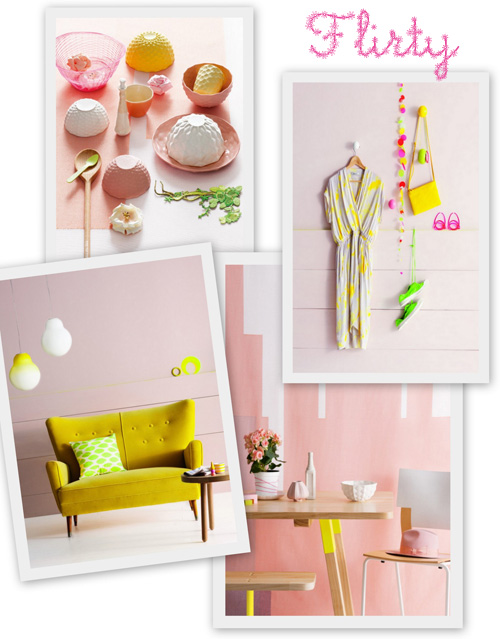
This is a trend I spotted in Amsterdam last week when I was out and about with Stephanie Rammeloo who is also quite keen on this color combination, too. I saw these tones together on a wall and my heart exploded with joy! It made me so happy to see something before me that I felt such an immediate connection to. Have you ever felt like that about a color palette? I thought to show you the palette best, I'd share some products and images that fit the scheme I'm referring to since I know you're visual and well, seeing is really believing, isn't it? From mere text, it wouldn't seem as though a soft pastel like (god forbid I say this word), "peach", would look great with neon pink, mint green, butter cream yellow and bold copper but oh.my.goodness it SO does. See for yourself…
Interior ideas from Home Life.
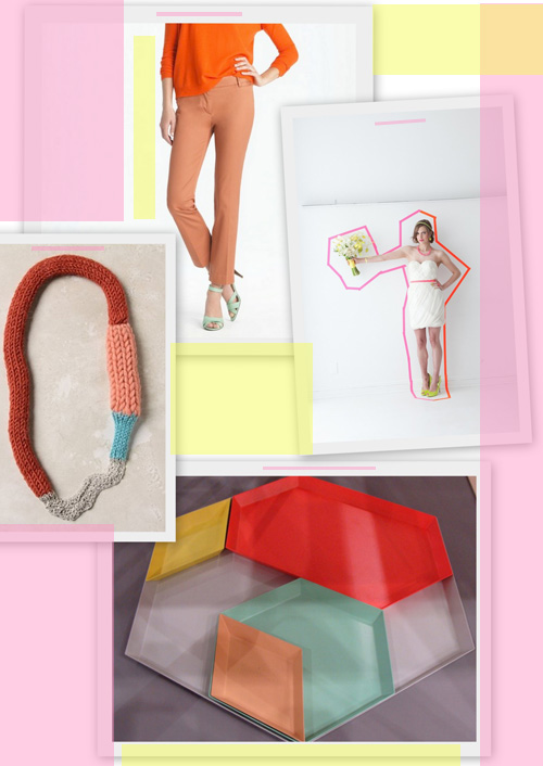
(copper, bright orange, mint green from J.Crew necklace from Anthropologie, tray from HAY, neons from BklynBride)
German ceramicist Nicole Mueller from Maison Sauvage
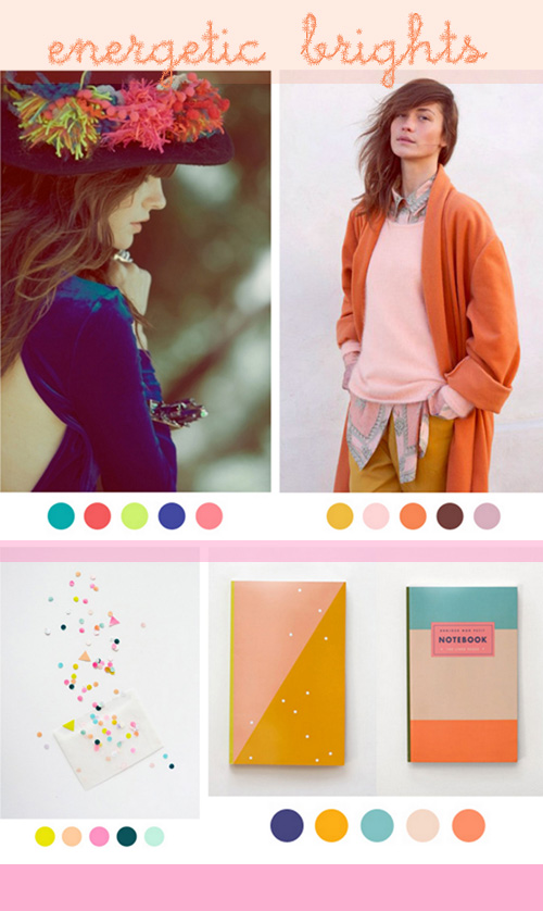
Different ways to combine these colors from Color Collective.
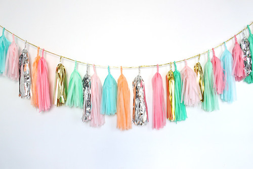
Confetti System (I wrote about them last January here.)
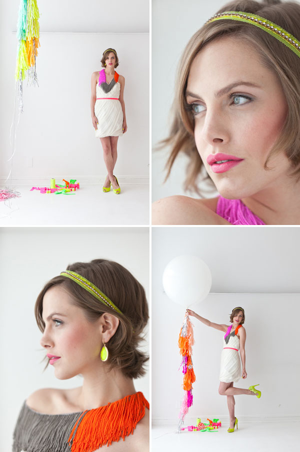
BrklynBride
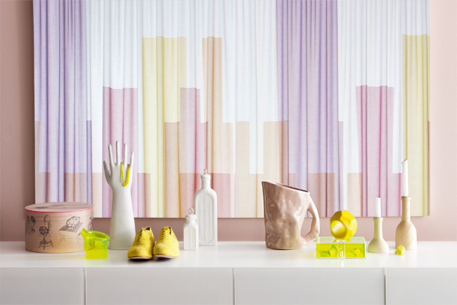
Interior ideas from Home Life.
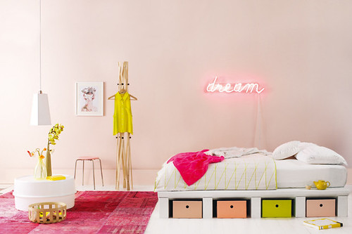
More from Home Life.
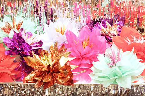
Confetti System (I wrote about them last January here.)
I'm loving this trend and feel so inspired by it, you too?
(images: linked to sources above.)
Please note: daily news and quicklinks are excluded from the RSS feed. Get the scoop on the latest finds directly on decor8! (in the upper right corner of the site). Content ©
decor8. For personal, non-commercial use only (public syndication is not permitted). Feed ID: cdaa5590db8fca9e92d06113ccfa4e5e
Related posts:
- Accepting Natural Pauses + Japan Inspired
- Wood & Wool Stool
- My Wood & Wool Stools!